Chapter 5 Results
5.1 Market Capitalization of Cryptocurrencies 2020-2022
The value of the total cryptocurrency market has risen to more than 1.5 trillion, owing to the meteoric rise of bitcoin, ether, and dogecoin. With a market cap of approximately 67 billion, Dogecoin alone is worth more than 75% of the companies in the S&P 500. Although digital currencies have grown in popularity in recent months, they remain a small part of the global markets for stocks, bonds, and gdp.
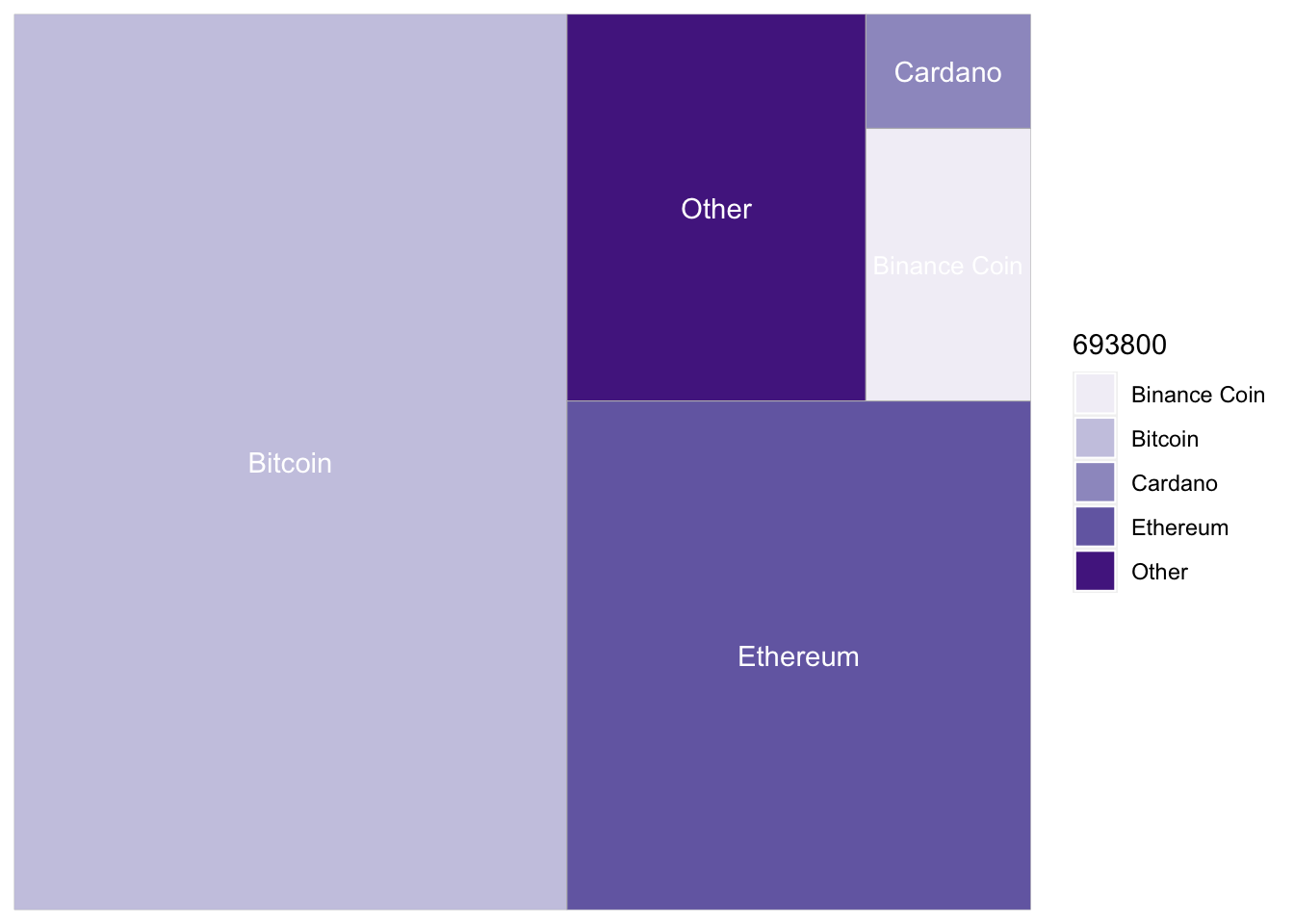
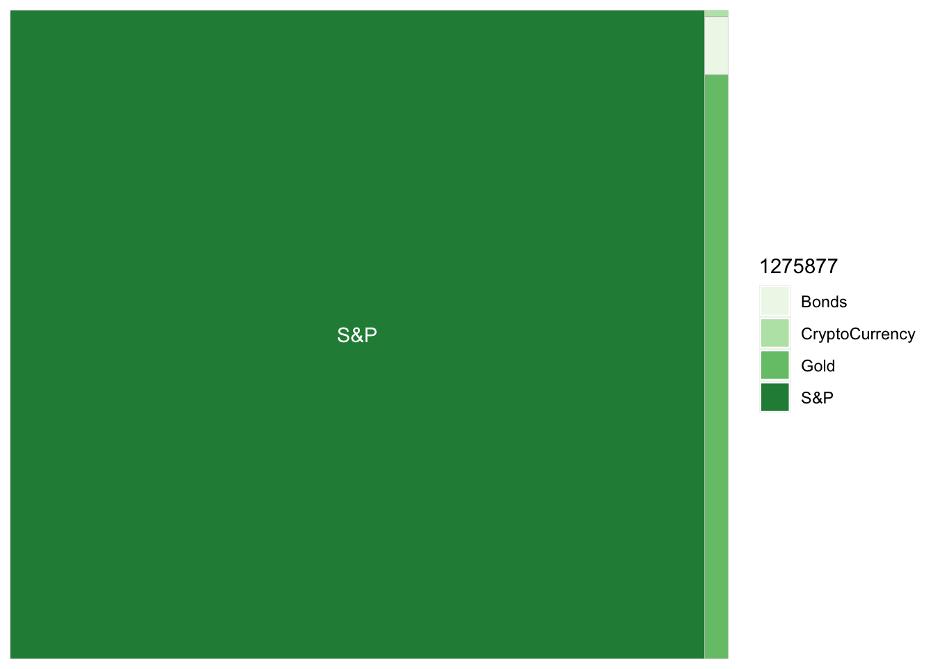
The above graphs show the cryptocurrency market share by coin and also the crypto market versus the stock market. There is still a long way to go to close that gap.
5.2 Newer Entrants Are the Top Drivers of Cryptocurrency Growth
We weren’t surprised to discover that Bitcoin accounted for most of the growth of the cryptocurrency market in aggregate, but it was surprising to see that Bitcoin has rapidly lost market share to these other cryptocurrencies in recent months.
Ether accounts for the first leg of that lopsided growth. And though altcoins like Cardano , Binance coin and Dogecoin are often overlooked, their market share has grown substantially over the past months, and we will examine them below.
5.3 With great returns come great volatility
Much of the hype surrounding cryptocurrencies has been self-fulfilling. During the pandemic, trading volume increased as a growing number of investors gained access to crypto markets via a variety of platforms. Investors see incredible gains and enter the market, putting additional upward pressure on prices. However, every breathtaking rally has been followed by an equally punishing crash, and cryptocurrencies lack a fundamental anchor like the par value of a bond or the discounted cash flows of a stock.
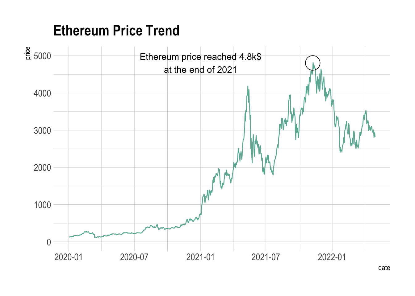
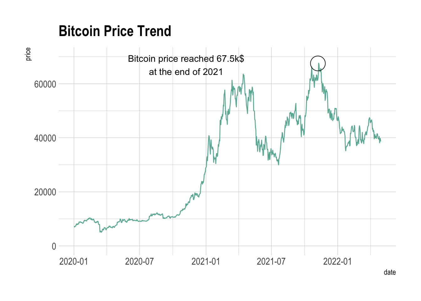
In the three graphs above we can see the price trends of each of the cryptocurrencies individually:
Ether has experienced sharp spikes and tumbles in its price as enthusiasts speculated on a wide variety of applications for the ethereum blockchain like NFT.
Bitcoin’s rise and fall seem to be cyclical, but trending upwards.
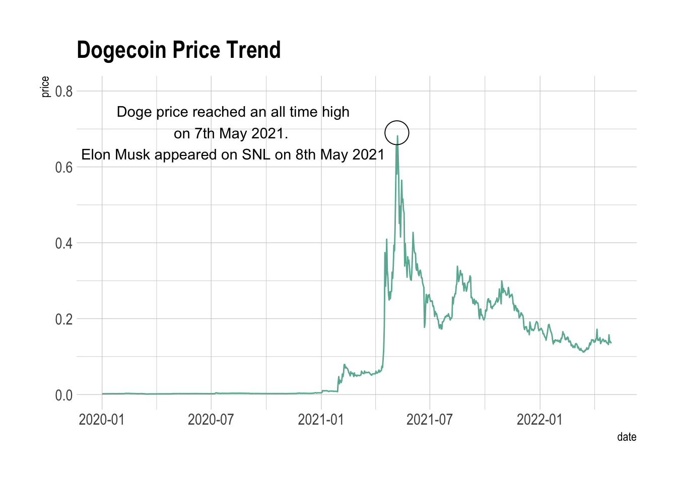
Doge had a meteoric rise and then nearly as catastrophic a fall but has since stabilized. The main use for it as a coin seems to baffle many investors as it is still mainly up there due to its initial “meme status”.
While the above graph shows just how far ahead price wise Bitcoin is, it also emphasizes via the Index and Percentage Change Charts how much Dogecoin flew, while the rest of the coins were much more stable, and much less volatile. We can also examine this via the distribution of the percentage change. This is represented below in a boxplot.
5.5 Twitter Correlation Heatmap
Below we examine a correlation heatmap between the % change in tweet frequency and the prices of the three cryptocurrencies of BTC, ETH, and DOGE.
 As observed in the heatmap above, there does not seem to be any strong correlation apparent. This could be due to the fact that we had observed earlier that the hike in tweet frequency volume precedes the price hike and do not occur simultaneously.
We can also observe any correlations, if they exist, between cryptocurrency prices. This is shown in the graphic below.
5.6 Cryptos Price Correlation
 As we can see here, the prices are very highly correlated in the cryptocurrency market place. Bitcoin and Dogecoin have a relatively low correlation of 0.721; this could be due to the fact that institutions view one as something stable and one as a joke or “meme”.
5.7 Stock Market
While the cryptomarket certainly boomed over the course of the pandemic and the last two years, it is equally important to examine that of the stock market as these two avenues are the ones most commonly used as investment areas. It also serves to look at how a tradiitonal market fares against a new and upcoming one.
The above graphs do not give much insight other than the fact that they are nearly mirroring each other. The graph on the far right is the exception as we thin of that as the Index’s Price. However, the Relative Index and Percentage Change graph show nearly indistinguishable plots.
The middle plot shows the volatility range of the Dow Jones and S&P 500. While there was a large spike in the negative and positive directions early on caused by pandemic undertainty and unrest, the fluctuation settled down in the < |5%| range. We can observe this distribution in the Boxplot below.
The candlestick charts below show the opening and closing price change over time for the S&P 500 Index and the Dow Jones Index. As seen earlier, the trends they follow are extremely similar.
5.8 Cryptos and Stocks Correlation
Mapping a correlation heatmap with respect to percentage change can give us an accurate idea of the correlations between these cryptocurrencies and the stock market.
5.8.1 Percentage Change Heatmap
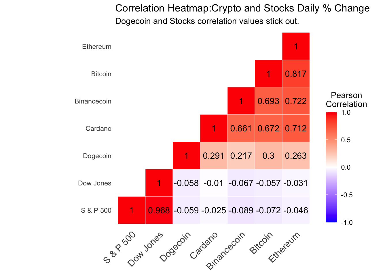 Using % change instead of price quiets down the correlations we saw earlier. Bitcoin and Ethereum are closely linked and have the highest correlation coefficients as they are the crypto market cap leaders. Moreover, Doge is isolated with much smaller values than the rest. Its meme period definitely attributed to this as its percentage change soared, the others did not change nearly as much.
We can also confirm what we saw previously in that the Dow Jones and S&P 500 are very much in sync. In addition, the correlation between the stock market representatives and the cryptos are effectively 0, showing no change or relationship with respect to each other.
5.8.2 Index Heatmap
Another version of our correlation heatmap can be computed by using the concept of a relative index we have used earlier in this chapter.
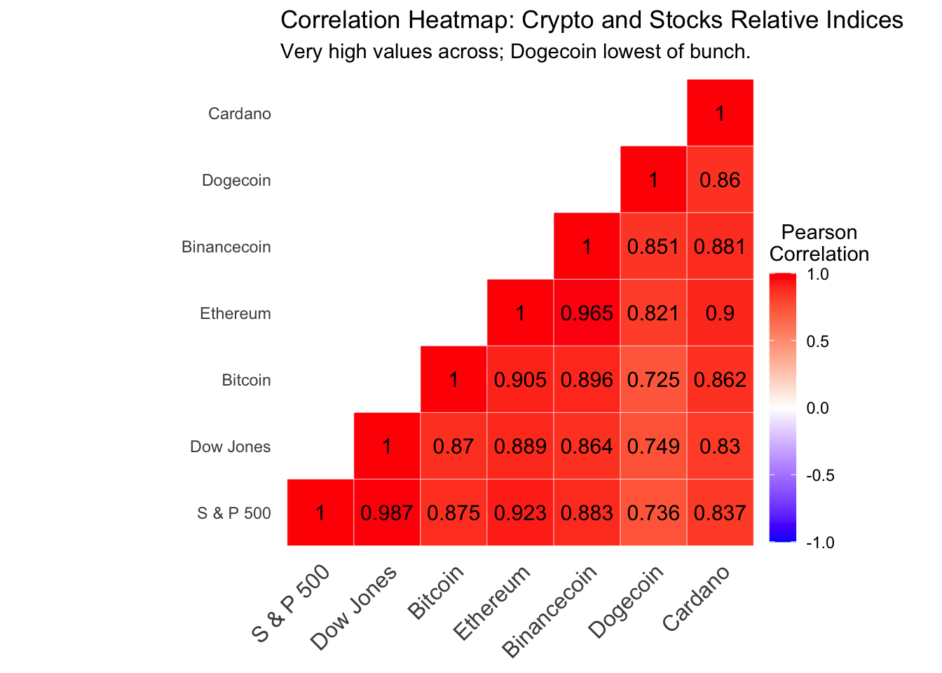 The Index version is useful because it essentially shows us a return over time from the beginning of our data, instead of a daily % change. This shows that there is a high degree of correlation between both the stock market and the crypto market. This could mean many things such as equilibrium over time and increased acceptance of the crypto market like the stock market.